Welcome to Skyrim Forums! Register now to participate using the 'Sign Up' button on the right. You may now register with your Facebook or Steam account!
You are using an out of date browser. It may not display this or other websites correctly. You should upgrade or use an alternative browser.
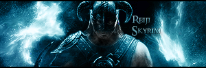
Thanks. The text is always the hardest part. I tried putting it in different areas but it took away from the light sources in the sig, so I put it in the dark spot so that you'd notice it when you looked at Dovahkiin.
Thanks. The text is always the hardest part. I tried putting it in different areas but it took away from the light sources in the sig, so I put it in the dark spot so that you'd notice it when you looked at Dovahkiin.
Looks nice. Good choice of colors and making it monochrome. It’s a bit too small for my tastes but it’s your signature after all so it should appeal to your first and foremost