Welcome to Skyrim Forums! Register now to participate using the 'Sign Up' button on the right. You may now register with your Facebook or Steam account!
You are using an out of date browser. It may not display this or other websites correctly. You should upgrade or use an alternative browser.
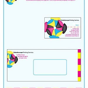
Another step in the project. We had to design letterhead, a business card and an envelope for the printing company we invented. I stuck them all together for easier viewing here. They're actually separate files. Critique welcome.
I should also add he envelope and card don't actually have the black line/border either. I did that when I put them together to make it easier to see what was what.
The one thing that keeps striking my eye is the size of the logo on the letterhead. I know "professionally", I should keep it constrained, but I dunno. I made it a much bigger feature of the business card and envelope and I like it more cropped but powerful. The letterhead feels... "standard" to me. It does, however, fit with the order and proof forms I did. So I'm kind of torn about it.
hmmm might look better a little higher up, to make things easier for the people printing stuff out on letterhead having everything at the top a uniform distance
Well, not sure if it's translated well into this jpg version, but if you can see the light blue "wash" across the entire document, that actually goes margin to margin (with a 1/4" allowance to the edge fo the paper) which is the standard printing capabilities of regular office printers. Some can manage 1/8" but you can't rely on that. So the logo "bumps" up against the margin on both the top and left as it is now. Now, I can do like with the business envelope, where I put what's called a "bleed" where it's meant to just chop off wherever the printer chops off, but the goal is to have it to the edge of the paper. This only -really- works when you print on bigger paper and cut the stuff down to size, like business cards.
Well usually the letterhead would then be put into some sort of template file in Word or whatever, then given to the client, with big text boxes that say "PUT DATE HERE" and "LETTER BODY HERE" and so forth.
Yeah. I like the full saturation of color. I'm somewhat hoping that with the addition of an address and postage, it would look ok. I'll have to see what it looks like printed out though to see if it's just too darned loud. Thanks for your comments!